Creating an app can be a scary endeavour to undertake, especially if you don’t fully understand the entire process and life cycle of software. This post is designed to answer questions and concerns we have heard over the years.
This knowledge stems from years of experience working on different software and will forever be a work in progress. I will update this post as we learn more and improve our internal process at Nano 3 Labs for creating new apps.
If you disagree, follow a different process or if any thing thing is unclear, please leave a comment. Discussion leads to progress and it is our goal to create a conversation around building new software products.
Furthermore, you will find the specific tools and techniques we use in the field. I included them here to show a cohesive process you can follow, not just theoretical principles.
Look at it as a recipe for creating an app. You can deviate from the recipe at times, but if it is your first time try to stick to it closely and adjust it to your flavour the second time.
We will use FitnessKPI, a fictitious fitness tracking app for resistance training as an example.
 Stages of building an Application
1. Research (Day 1–2)
Talk to the Users (Day 1)
FitWorld owns and operates 10 gyms on the west coast of the United States. They contracted us to build an innovative new app to help trainers and their clients achieve their fitness goals. Since they believe in the old saying, what gets measured gets improved, they decide to call it FitnessKPI. Furthermore, FitnessKPI will be a subsidiary of Fitness World and the software will be white-labelled and sold to other gyms who will pay a monthly fee for it.
We set up an appointment with Oliver Smith, CEO of FitWorld to visit one of the gyms and talk about the vision for the app. We ask to talk to the trainers at the gym and their clients to learn about what issues they face and whether or not they have used any similar products in the past.
We leave things open-ended and let them complain about everything wrong with the way things are currently done. We write it all down in an Evernote document and share it with the team.
Look at similar products (Day 2)
We take another day to take a look at similar products. We download and try every fitness app we can get our hands on. We pay special attention to the apps mentioned during our conversations with FitWorld.
We recognize what was done well and what wasn’t, keeping detailed notes to share with the team.
2. Low Fidelity Prototyping: Paper/Whiteboard Sketching (Day 3)
On the third day, we come back to FitWorld and sit down with CEO Oliver Smith and Head Personal Trainer Alex Campbell, to sketch out what an early version might look like.
We start by writing out the design principles we will follow. They will guide us as we start mocking the UI and serve as tie-breakers when we need to evaluate design alternatives or trade-offs.
Design Principles for FitnessKPI:
1. Quick to enter data 2. Fun to enter data 3. Encourages users to log their workouts 4. Shows users progress visually 5. Recommends improvements and workouts specific to user 6. Encourages the users to push themselves at the gym 7. Gain market share
Number 7 brings a very interesting question to mind. How will users find us? What is our distribution channel? In other words, how do people find out about the app?
Since FitWorld has over 2,000 members in each of their 10 locations, we have the names and emails of 20,000 people we can market the product to. An email marketing campaign and in-gym ad placements can be used to promote the app. In addition, Oliver knows the owners of other gym chains across North America who are interested in a white-labelled version to promote their gyms.
We know our users are: Gym Owners, Personal Trainers and Clients. Since none of the principles defined above talks about helping personal trainers specifically we can safely ignore them for this version.
We then have the following personas:
1. Gym Owner 2. Personal Trainer 3. Client (Gym Goer)
Now we are ready to start sketching some designs together. We chose to focus our limited time together figuring out what inputting information during a workout might look like.
Data entry is a tedious task and is the barrier to the adaption of most fitness apps; therefore, it makes sense to focus most of our efforts on getting that part right.
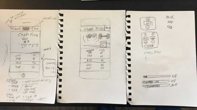
Our sketches look like this:
Notice that we started with a Mobile First Design and even attempted to use the Apple Watch as a way of inputting data. We know users will only have their phone with them at the gym and assume the workout would be created a head of time on a desktop or automatically generated based on muscle recovery.
After we chat between ourselves and agreed on what we think is right, we went downstairs to the gym and showed the sketches to a few clients to see what they think.
The feedback we got suggested things made sense to most people. They liked our sketches and showed us some of the apps they currently use. One person even showed us a paper print out he uses to track his workouts.
We can now proceed to the next step which is making a high fidelity sketch.
3. High Fidelity Prototyping: Sketch and InVision Prototypes (Day 4–9)
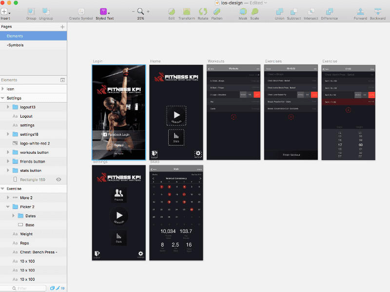
Next, we open Sketch.app and start creating the different screens. Focusing on the user interaction and functionality rather than style. We use basic styles without obsessing too much about things like colors, fonts and spacing (we will leave that to the Visual Design phase).
We upload things to InVision using the InVision Craft Sync utility and link all the screens. We then test it on our phones to make sure things flow in a logical way and the user is never “trapped” on any screen with no ability to go back.
We share the prototype with the team and encourage them to leave comments right inside of InVision.
Visual Design (Day 10–14)
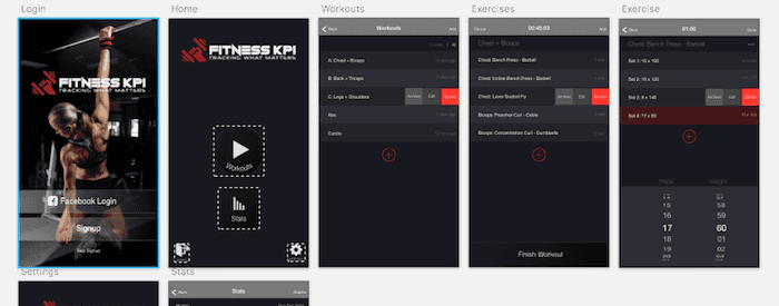
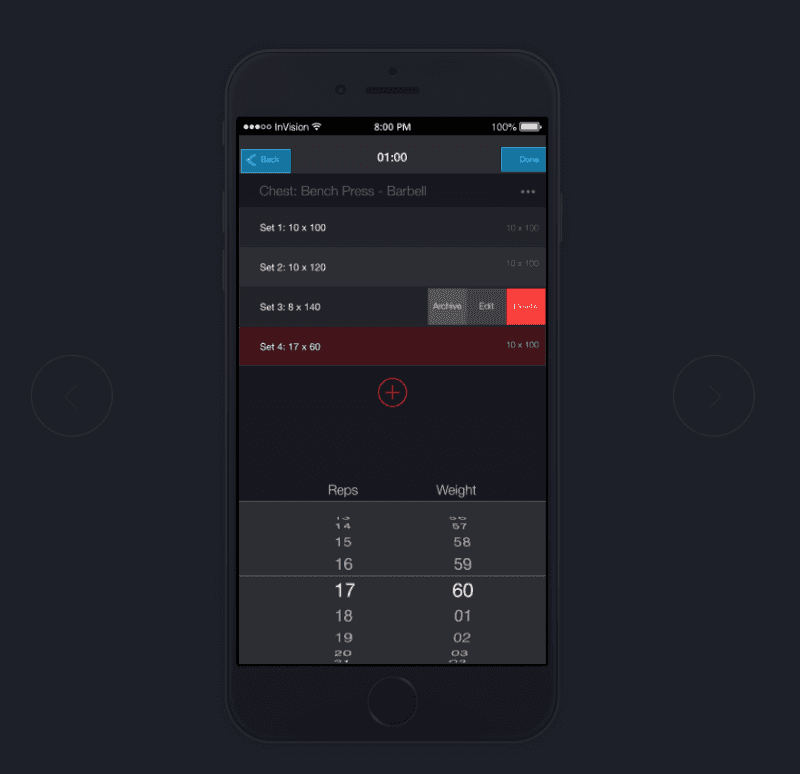
Finally we attend to the Visual Design of the app. We spend 1 day playing around with different looks and settle on the following:
We choose to do the visual design at this stage before showing it to the users again because an aesthetically pleasing design is perceived to be more user-friendly.
From our experience, if we skip this step and show the users the unpolished mocks the feedback will be focused on the visual issues rather than usability issues.
InVision Prototype: https://invis.io/K9AEC7SSV
Now it is time to come back to the gym with our phone and show the clients what we have been up to. We try to let them click through the prototype and see what they do. If they get confused we guide them through it. Certain interactions are impossible to test with InVision and will be tested in the next phase.
Alternatively, consider starting with a mood board to help get a feel for the color and feel of a visual design direction.
See: Part 2: Functional Prototype + Production Deployment for how we can add interaction and release it as a usable product.
— — —
If you enjoyed this post, please like it and recommend it to others. If you follow a different recipe please share it with us in the comments below.
Feel free to drop us a line at hello@nano3labs.com to chat about your project or if you feel like grabbing a real or virtual beer with us.


