Creating our company logo
nano3labs was first conceived almost four years prior to us becoming a “real” company. In 2013, after handing in my resignation to one of the first startups I worked at, I wasn’t sure what I would do next. Maybe it was time to start my own business like I always wanted. All it needed was a name.
After watching television one night I saw the logo used by the brilliant series Breaking Bad. I began to wonder how they came up with the name and logo. Perhaps great artists can indeed steal great ideas.
The idea of using a chemical compound to form our brand struck me as neat. After a few days of white-boarding and many terrible names, I stumbled upon NaNO3 — Sodium Nitrite aka Chile saltpeter, which is sometimes used as an oxidizer for fireworks 🎆 Jackpot! We got a name.
Since nano3.com was taken, we added the labs for an even better scientific reference 🤓. Another beautiful part of the name was nano‘s meaning of small and the positive connotations it carries in the technology sector. There we have it then: nano3labs.com. Time to register, sit back and profit 🤑. (Or so we thought.)
Of course, life got in the way. We partnered with my roommate, Anton, and created 0idle (zero-idle): an AirBnB-inspired startup to transform the way we see empty and idle spaces. Our first startup, like many, failed.
After 0idle, I spent over two years doing freelance work. Still, I found myself wanting to start my own consulting company and it was time to make it a reality.
Like any reasonable entrepreneur, I turned to Fiverr to help create a few options for our new logo. I wrote up a quick description and picked three different designers to try their hand at it.
Having little clarity on the goal and giving it to inexpensive designers didn’t help. I thought to myself “maybe they can come up with an idea for me, they are the experts after all”. As always, garbage in, garbage out 💩.
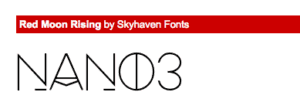
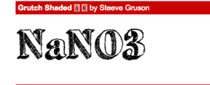
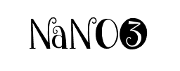
Hmm, not really what I had in mind. Maybe if I can help them select the font. So I looked at a few weird fonts.
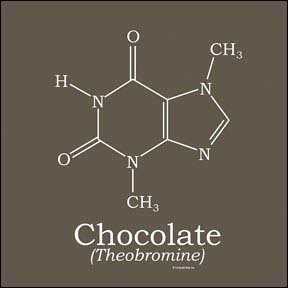
We were still using the chemistry inspired name capitalization NaNO3Labs. I thought of Breaking Bad and their logo design. Maybe I can borrow an idea from it. After some more googling I came across the formula for chocolate.
This is what the formula for NaNO3 looks like.
No matter how hard I tried, I could not get it to look right.
After a few days, I finally asked myself “do we really want to appear to be a chemical company? It has absolutely nothing to do with our actual business.” What if we focused on the word nano and made it seem like a small, compact and advanced company, just like we want to be seen.
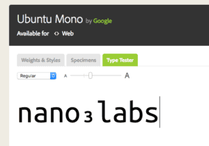
Maybe we can start by using a font developers love. This will help us better communicate the services we provide to our clients.
Not bad! I like it.
What if we tried to sprinkle a little computer science in there with an O(n) notation.
Too many brackets and it needs to be read backward to make sense. Let try again.
Better, still not quite.
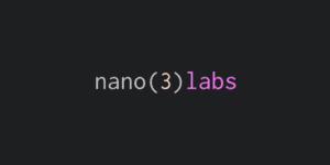
Let’s put it in my favourite text editor, atom, and see what we get.
Damn looking good!
Time to ask for a design revision from our Fiverr guys.
Not quite there.
Wait a minute! I have an idea what if we used the atomic energy symbol, it is used by both React.js and Atom?! After all, what is smaller than an atom (yesElectrons I know, smarty pants).
Quick mock.
And let’s ask the designer to do his magic.
Amazing! But come on gotta have 3 electrons there, after all, we are nano3labs.
Almost! Just need to move one electron be on its own ring.
Finally! Perfection.
Hope you liked our story. Feel free to share your story in the comments below.
Originally published: http://nano3labs.com/blog/creating-our-company-logo/

