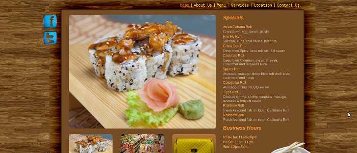
A friend of mine owns and runs a store in Winnipeg under the name: "Asian Cabana". He asked me if I could build a website for his store to help him attract more customers. After meeting with him to discuss it further, I accepted and immediately started working on it.
Paper Sketch
It all started with a paper sketch, or a few sketches to be exact. I always like to start this way to get a feel for what I need to do. The beauty of paper is that it does not complain no matter what you put on it. It has no rules, things do not have to make sense or work a certain way. This allows complete creative control, which is exactly what I needed at this stage as I had no idea what things will look like.
Photoshop Layout
At this point I used the paper sketches I created and added some color and structure to them. I must admit that my first layout was terrible, it lacked a good color scheme and a general sense of direction. I knew that my client would like the wooden feel, since they showed me a business card design they liked with a light wooden texture. From that point on I had a good mental picture of what it should look like. But, I was not happy with the results of my first attempt and decided to wait until the next day to try again.
The next day, I found an amazing wooden texture online. I made a few adjustments to it and threw it into photoshop. From that point on it was a trial and error process, but I really did like the direction things took. Even when it was half done, I could see the potential of the design. The rest of the design just came out naturally, despite a few bumps on the road. By the end of the second day I had a layout to be proud of that I then showed to my client.
Poster - My First Attempt at Print Media
The owner loved my layout so much that he asked me to create a poster for them to be posted in several other stores for advertising purposes. I told him that although I have never done print media before, at least not commercially, I will love to give it a try. I modified the original web layout and created a 11" X 8.5" poster with a simpler and more visible message. The poster focused on the Sushi dishes the store offered and was designed to help increase sales.
Static Development - HTML + CSS
Finally, it was time for the fun -- yet challenging -- part of cutting the layout into something that can be used on the web. I started by using slices in photoshop and saving parts of the layout as images. I then used these images on my CSS and HTML code to mimic the look of the layout. Perhaps the most challenging part was getting the shadow cast on the wooden texture by the content area to work. Since I used a color burn in photoshop to create this, I could not just use a png image to create that shadow. It just did not look right. Some of you maybe wondering why I used that effect to begin with if it was hard to recreated on the web. Well it is really simple, I was wearing my designer hat, not my developer hat during the layout creation stage. And that is the way it should be. You do not want to restrict your creativity by focusing on what will be hard to do in code, your role as a designer is to create a unique layout. Let the programmer you worry about how to implement it on the web later. I ended up using images that included the wooden texture in the background along with the shadow. It may not be perfect, but it works quite well.
Dynamic Development - JS + PHP
After the home page presentation part was done and looked good across all browsers, it was time to add some dynamic aspects to it. I used jQuery for some simple image effects on the front page and some previously written code for form validation in plain old JavaScript on the Contact Us page. PHP code was used to separate the website into header and footer sections so it can be easily modified across multiple pages. The same Contact Us page also uses PHP to validate and send the message.
Conclusion
This is a great project that I still have some work to do on, but I am very glad to be doing this. I have already learned a lot from this project, and it was a lot of fun. It always amazes me how much better my designs look the on my second try. It is so different that it can be mistaken for 2 different designers doing the layouts. So, if you ever create a design or write code that you are not happy with and start having doubts about your abilities, remember what Winston Churchill once said: "Success is the ability to go from one failure to another with no loss of enthusiasm". Keep trying and you will be surprised what you can achieve, I certainly was.
